Let’s talk honestly for a moment.
Website UX for lead generation is not about getting hundreds of enquiries every week. It’s about getting enquiries from people who actually understand your business and genuinely need what you offer.
A lot of companies put major effort into advertising, SEO, and social platforms. Traffic increases, leads come in, but most of them are irrelevant, confused, or price-shopping. That’s not a marketing problem. That’s a UX problem.
The good news is you don’t need to redesign your entire website or spend a fortune. Small, thoughtful UX changes can quietly improve lead quality without increasing traffic at all.
What Is Lead Quality
A high-quality lead is someone who:
- Knows what your business does
- Has a real problem you can solve
- Is ready for a meaningful conversation
A low-quality lead usually comes from confusion. They fill out your form because something looked interesting, not because it was right for them.
A low-quality lead usually comes from confusion. They fill out your form because something looked interesting, not because it was right for them. When expectations are unclear, conversations often start on the wrong foot. This leads to wasted time on both sides and enquiries that don’t go anywhere.
Good UX helps visitors understand things clearly before they contact you. And when people understand, lead quality improves automatically.
Why More Leads Is Not Always Better
Many businesses chase numbers.
More traffic. More clicks. More leads.
But more leads often means:
- More time wasted on follow-ups
- More calls that go nowhere
- More frustration for sales teams
Good UX focuses on quality, not quantity. It helps the right people move forward and gently stops the wrong ones – without making anyone feel rejected.
This creates healthier conversations from the start.
It allows teams to focus their energy on people who are genuinely interested and ready to move forward.
First Impressions: What Users Notice First
Visitors make a decision about your site almost immediately.
They notice:
- Your headline
- Your layout
- Your main message
If your headline is unclear or too complicated, users either leave or misunderstand what you offer.
Simple UX fixes include:
- One clear headline explaining what you do
- One main call-to-action
- Clean design with enough white space
When people understand you quickly, the leads you get are already better informed.
Clear Messaging = Clear Leads
Confusing messaging creates confusing leads.
Avoid:
- Buzzwords
- Long paragraphs
- Trying to explain everything at once
Instead:
- Speak like a human
- Explain one thing at a time
- Focus on the problem you solve
Clear content helps visitors decide if you are right for them – before they fill the form. Clear messaging builds trust even before someone clicks on your form. When visitors feel understood, they feel more confident taking the next step.
The clearer your message is, the more intentional and relevant your leads become – because people reach out knowing exactly what to expect.
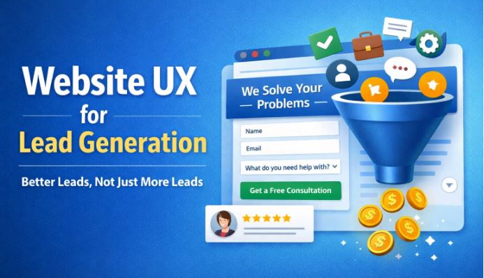
Simple Forms That Attract Serious Enquiries
Many people think longer forms mean better leads. That’s not always true.
Long forms often scare away good leads who are just getting started.
A better approach:
- Ask only what matters
- Add one qualifying question
- Keep it easy
For example:
- Name
- “What are you looking for help with?”
Forms should start conversations, not interrogations.
Small Words That Make a Big Difference (Microcopy)
Microcopy is the small text people usually ignore – but it matters a lot.
Examples of good microcopy:
- “Get Free Consultation” instead of “Submit”
- “No spam, ever” under email fields
- “Takes less than 30 seconds” near forms
These small details reduce hesitation and attract more intentional enquiries.
Speed, Navigation, and Trust Signals
If your website is slow, people lose patience.
If navigation is confusing, people feel lost.
If there’s no trust, people hesitate.
Simple UX improvements:
- Faster page loading
- Clear menus
- Testimonials and reviews
- Client logos or case studies
Trust-focused UX attracts serious leads – not casual browsers.
Mobile UX: Where Lead Quality Is Won or Lost
Most visitors come from mobile devices.
If your website works only on desktop, you’re losing quality leads.
Focus on:
- Easy-to-tap buttons
- Short content sections
- Mobile-friendly forms
A smooth mobile experience often means higher-intent enquiries.
Using UX to Filter the Right Audience
Not every visitor should become a lead – and that’s perfectly okay.
Good UX clearly communicates:
- Who your service is for
- Who it is not for
This honesty saves time for both sides and improves lead quality naturally.
How to Measure Lead Quality from UX Changes
You don’t need advanced tools.
Look for:
- Fewer but more relevant enquiries
- Better sales conversations
- Higher conversion rates
Quality improvements usually appear before quantity.
Final Takeaway
Small UX changes can quietly transform your lead quality.
Clear messaging, simple forms, and smooth navigation help the right people reach out.
Small UX changes can quietly transform your lead quality. Clear messaging, simple forms, and smooth navigation help the right people reach out.
Good UX saves time, reduces confusion, and makes conversations more meaningful from the start.
If you’re looking to improve website UX for lead generation in a practical, human, and business-focused way, Virtual Oplossing helps brands turn simple UX improvements into better-quality business conversations.
FAQs
1. Can UX really improve lead quality?
Yes. Good UX helps visitors understand your offer clearly, which naturally improves lead quality.
2. Do I need a full website redesign?
No. Small UX changes often deliver big improvements.
3. What is the most important UX factor for lead quality?
Clarity. When users clearly understand your service, better leads follow.
4. How does mobile UX impact lead quality?
Most users browse on mobile. Poor mobile UX often leads to poor-quality enquiries.
5. How long does it take to see results?
Some UX changes show improvements within weeks, especially in enquiry relevance.
Copyright: All rights reserved. Unauthorized reproduction or distribution of any content on this site is prohibited. For permissions, please contact https://www.virtualoplossing.com